China mhome Brand Identity
Branding, Advertising and UI
mhome is a China internet furnishing startup, headquartered in Hang Zhou (previously Shen Zhen, before being acquired by Ya Sha) that has developed its own set of technology, logistics, and work procedures, to provide a one-stop renovation and furnishing solution for Chinese consumers.
I was tasked to develop the brand for the company, as they are preparing to expand its services throughout major Chinese cities. mhome needed to portray itself as an international tech brand, comparable to companies such as Apple & Airbnb, but in the home renovation and furnishing industry. The aim is to provide high-quality renovation services at a reasonable price by tapping on economies of scale when the same renovation design and processes are adopted by consumers. This is similar to how Apple sells only a few models of its iPhone at any given time – mhome believes that a few renovation designs will be sufficient to satisfy a majority of its customers.
The Logo
Brand Identity
The mushroom logo mark was retained from the original logo that was created previously. My original suggestion was to change the name to ‘mroom’ as an abbreviation of mushroom, and bringing out the idea of the renovation of a ‘room’ but the company decided that it needs to emphaize the idea of a home, hence the name mhome. The logo pays tribute to the mushroom shape houses in Smurfs’ village and reflects a fun and colourful tech brand.
Based on the shape of the logo, with a gap in the outline of mushroom silhouette, I developed a word mark with gaps from the font ‘Anivers Regular’ to match it with the logo mark. The curves and the thickness of the font also match that on the logo mark.
Advertisement
Branding through Advertising
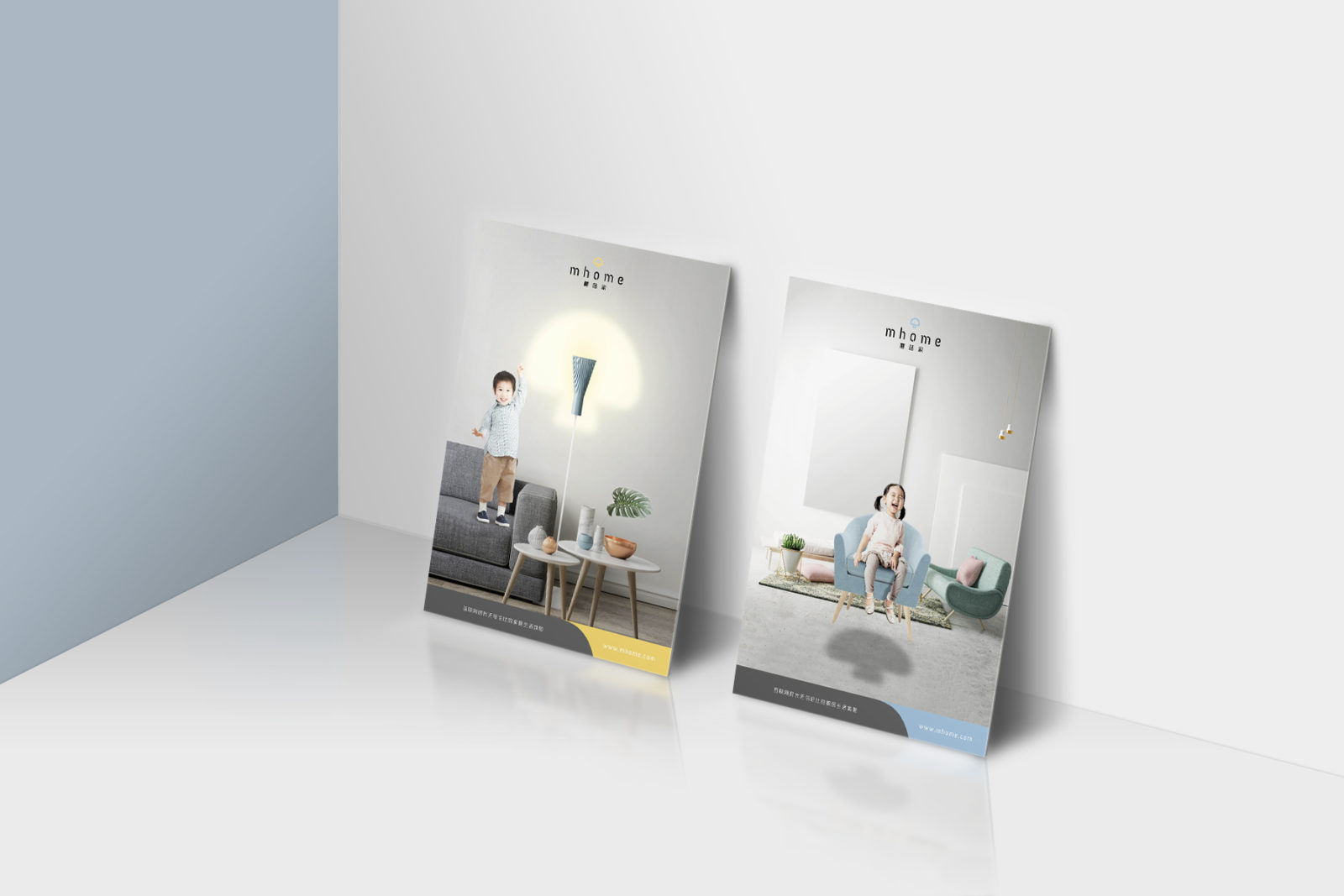
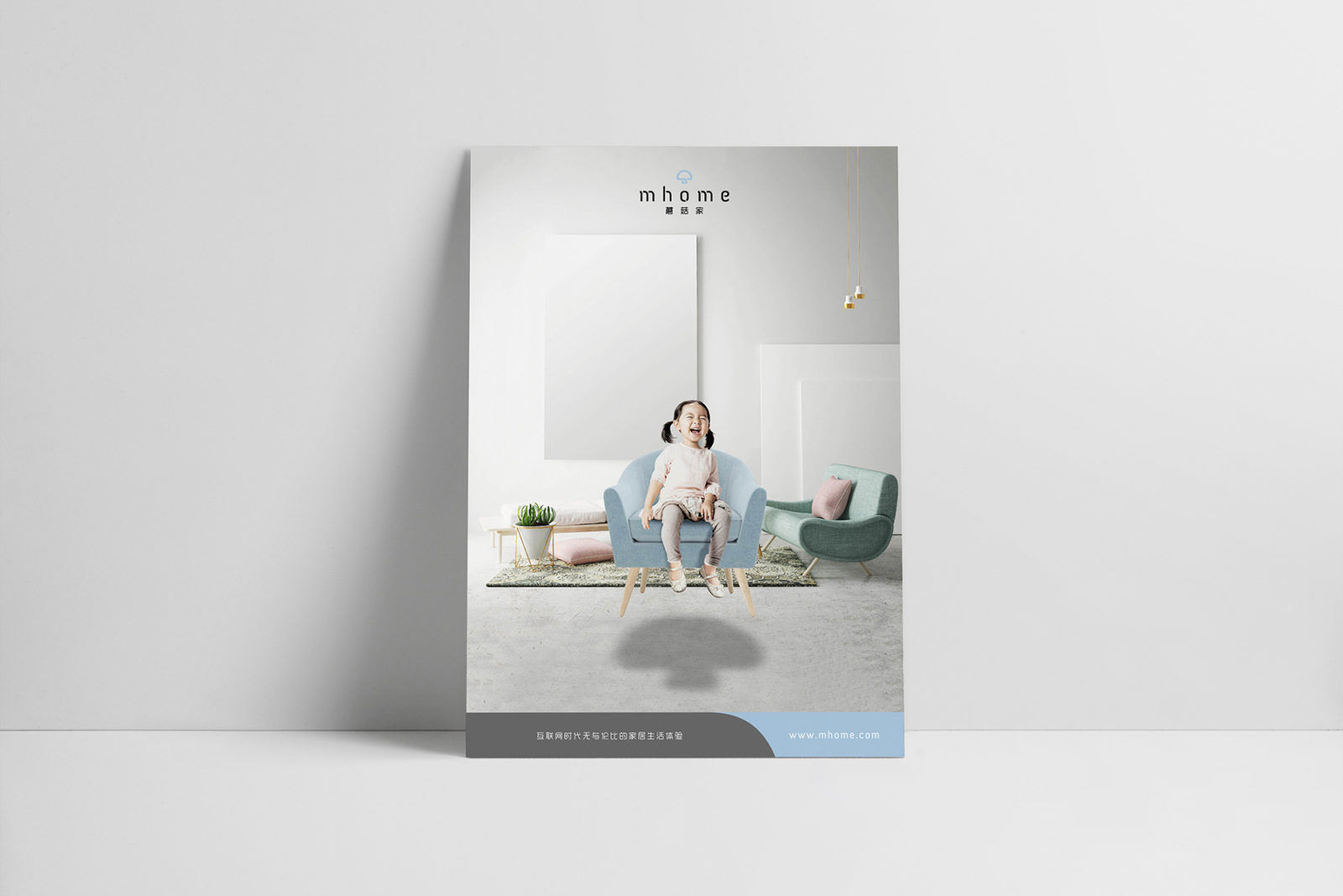
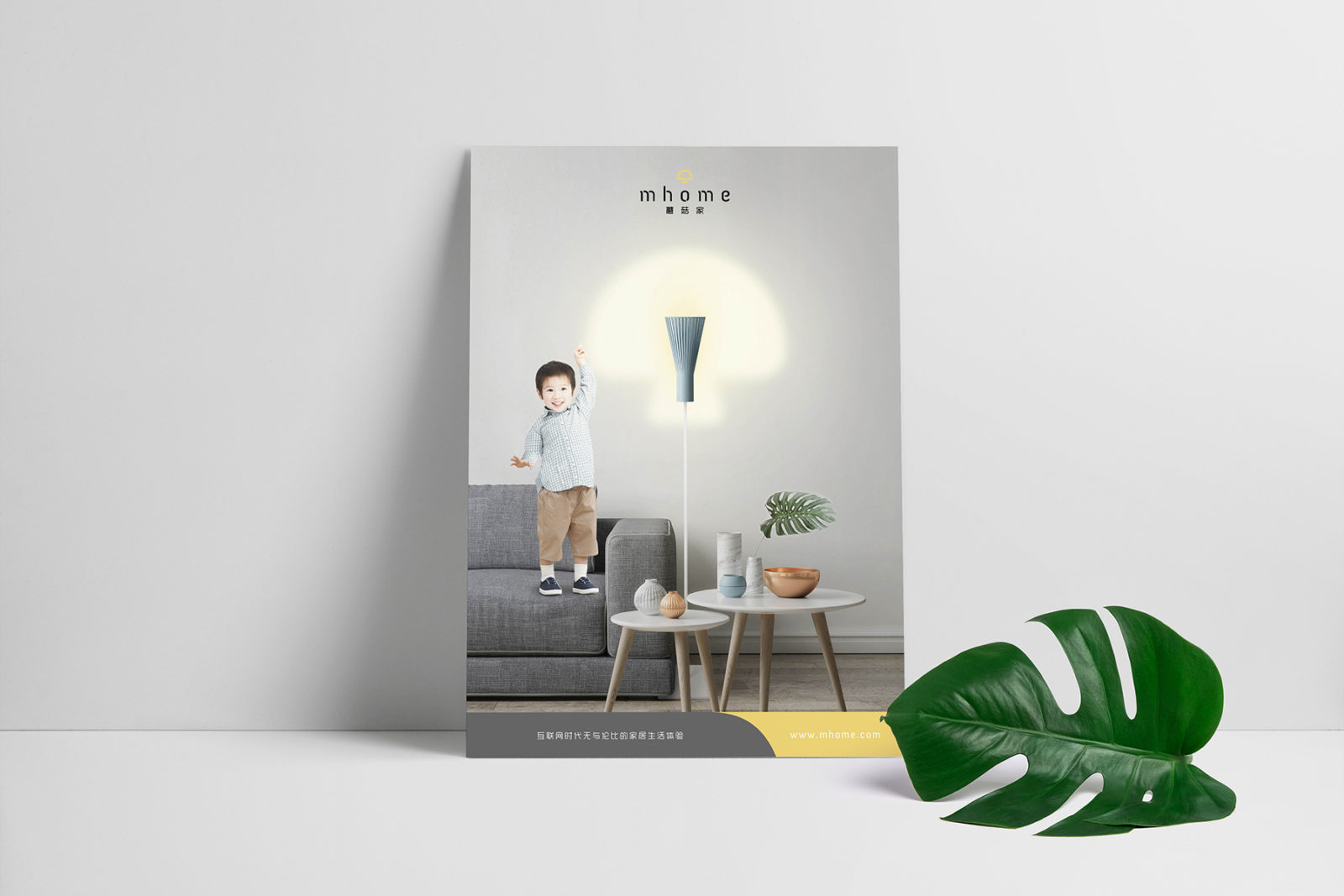
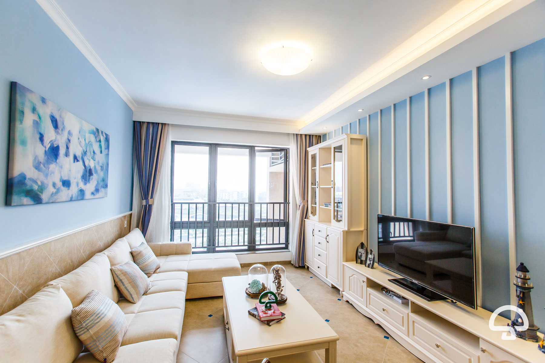
mhome wishes to emphasise the idea of a ‘home’ made up of a typical family nucleus, i.e, parents with children. Naturally, children are chosen as models for the advertisements not only to reinforce the idea but to portray their innocence and sense of curiosity as a reflection of the brand ethos and the young startup. With a little touch of magic, the shape of the shadow cast on the floor, and light reflected on the wall, introduces the brand logo (silhouette) to new customers through the advertisements.
The choice of Scandinavian interior design with subtle pastel colours against a grey and white backdrop, contrasted with rich textures of fabric, wood, cement, marble, and greenery resonates with current tastes and preferences and reflects a modern, urban living. The clean and spacious approach is in line with tech companies’ preference for minimal clean presentation of their products (think Apple).
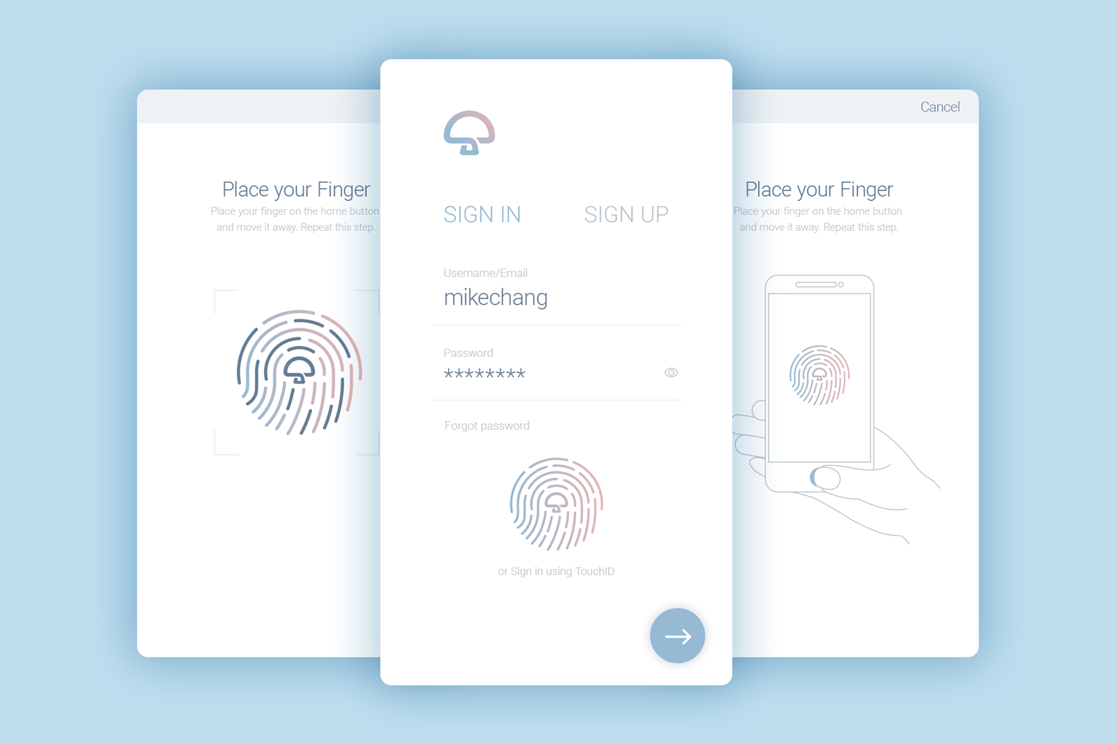
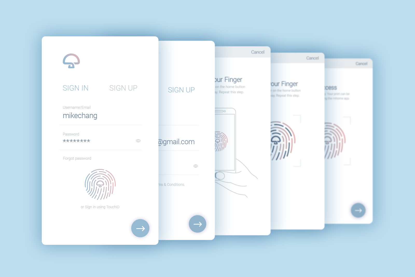
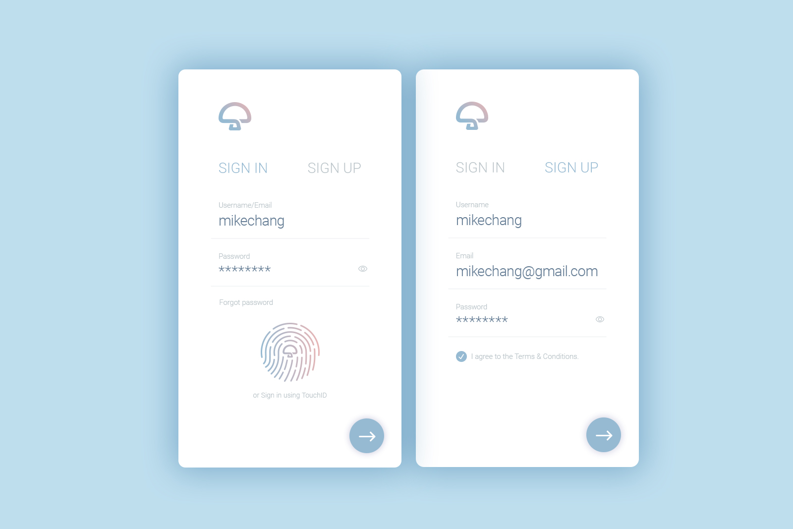
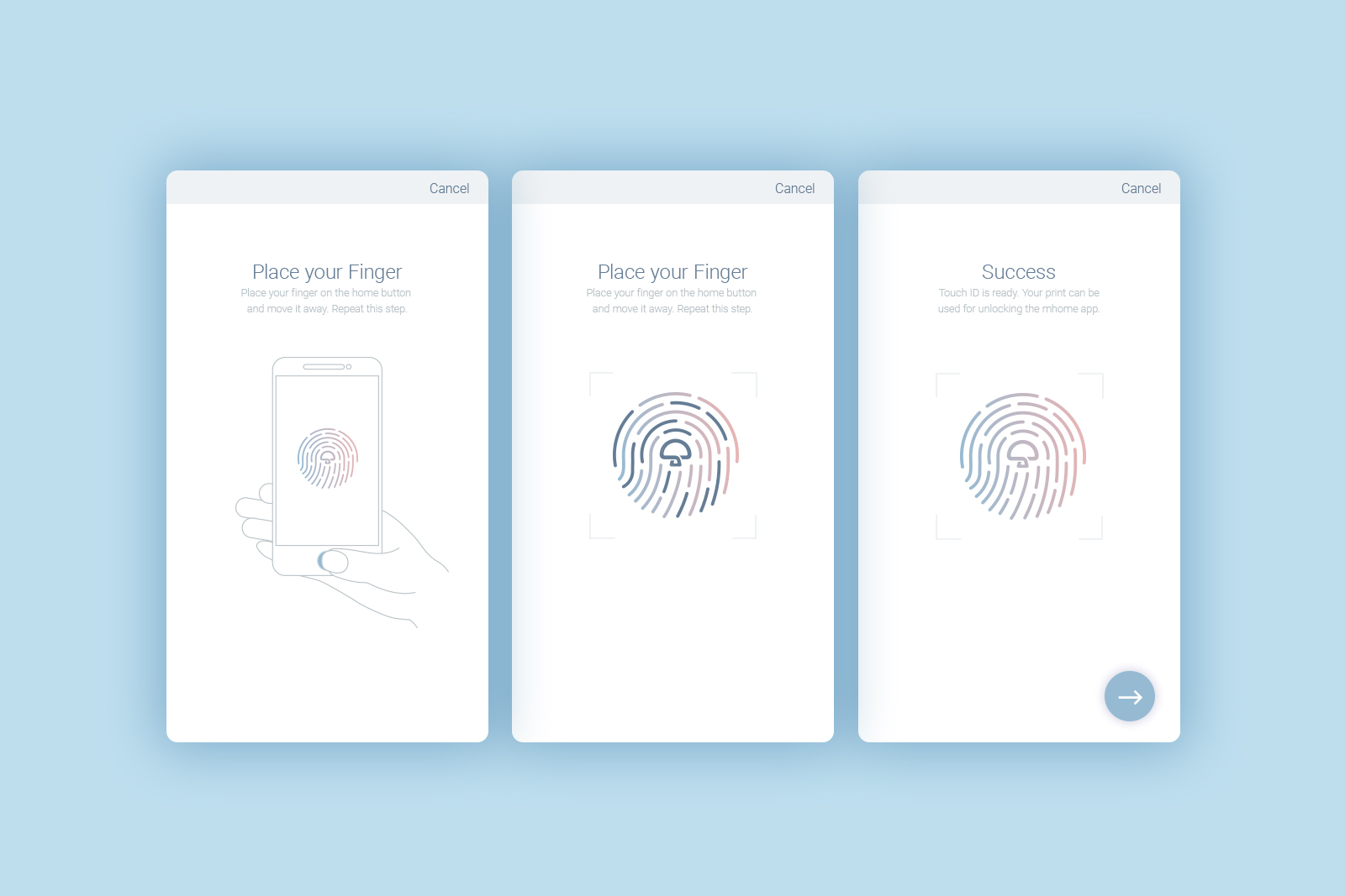
App Sign In Sequence
UI Work-in-progress
I started taking part in the Daily UI Design Challenge and one of the challenges include a login screen. As fingerprint sign in/sign up is gaining in popularity, I decided to bring the challenge a step further by introducing this feature to a mobile app. Since the feature is rather new, it was difficult to find good design references. I had to do a research on Dribbble and Pinterest to figure out the best way to design this for a good user experience.
Background Information
About mhome
mhome develops its own virtual reality technology, enabling customers to visualise themselves in their home (refer to video by mhome) prior to committing to a design. Customers get to have a visual walk through a highly accurate rendered environment and to choose between different renovation themes.
Project Details
— Studio
mhome, China
— Project Date
October 2014
— Design & Direction
Leow Hou Teng
— Project Category
Advertising, Branding
— Deliverables
Logo, Brand Advertisements
Feature this Project
Share this project on social media, or on a blog post!