Family Justice Courts of Singapore Branding
Branding & Corporate Identity Guidelines
The Family Justice Courts of Singapore, established under the Family Justice Act 2014, came into being on 1 October 2014. The Family Justice Courts are set up as specialist courts to deal with family issues and cases involving youth. As a key constituent of the Singapore Judiciary, it is important for the FJC to maintain a consistent and distinctive identity within the Singapore Judiciary and to the public.

The Logo
The Home and the Court
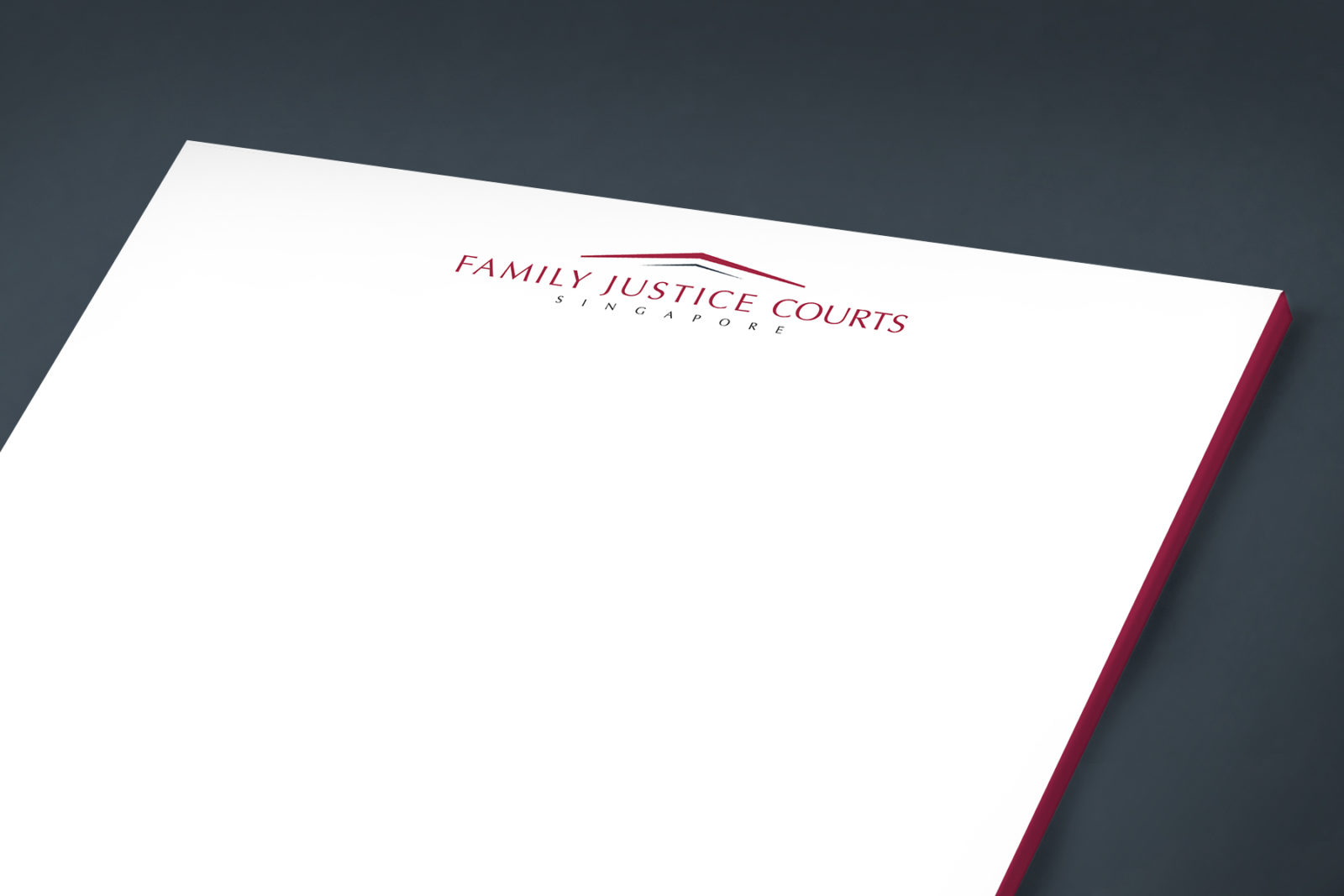
The Family Justice Courts logo is a symbolic representation of shelter within the visual frame of a traditional courthouse. The outer maroon roof encapsulates the vision of the Family Justice Courts to be a source of justice that protects, empowers and restores individuals from troubled families. The inner roof reflects the commitment of those working within to build a vibrant, inclusive and cohesive community. An elegant typeface emphasises our aspiration to remain a modern and relevant, yet sturdy, custodian of the rule of law.
The design of the logo is consistent with the existing State Courts of Singapore and the Supreme Court of Singapore logo in terms of its look-and-feel, design, and its colours.
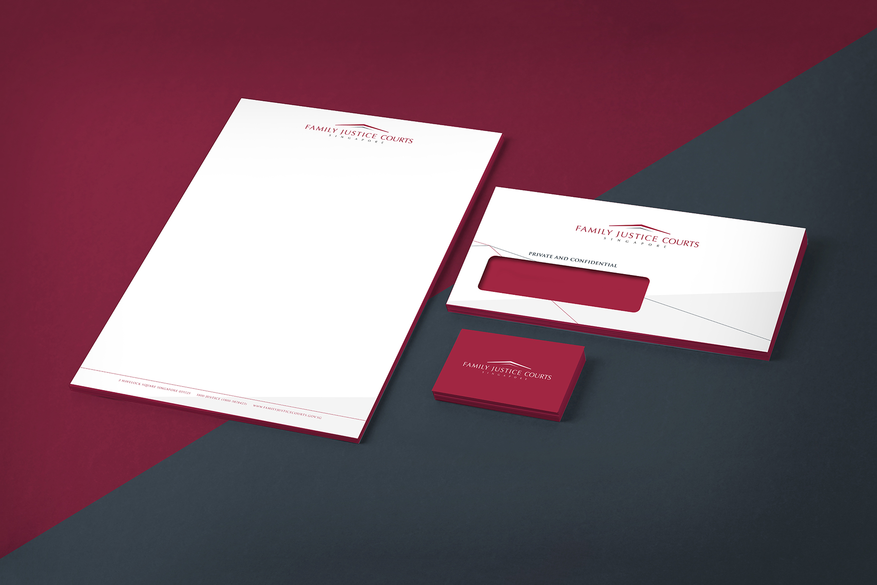
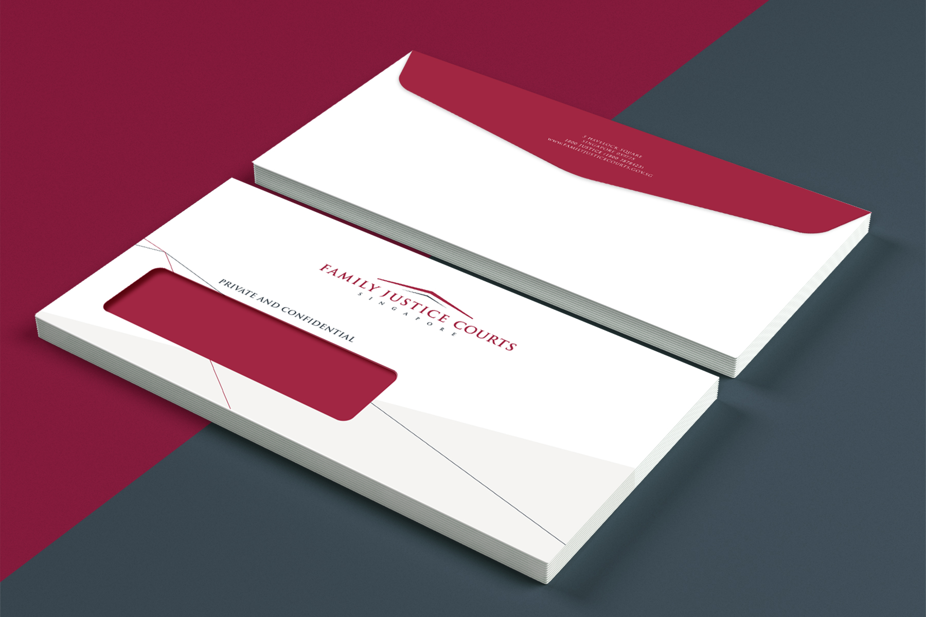
Stationery Set
Logo Application across various Corporate Templates
Corporate templates have been designed to reinforce the Corporate Identity, to serve as visual reminders of the identity of Family Justice Courts to existing and potential recipients.
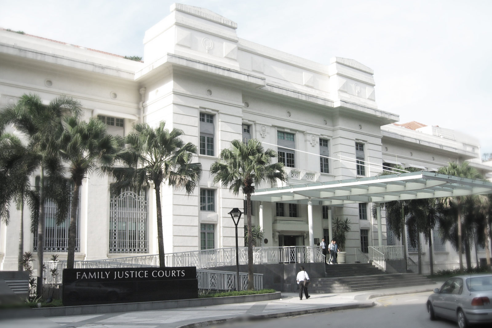
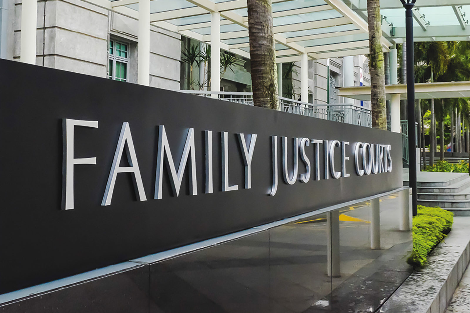
Signages
Logo Application on the Building and its Surroundings
As the signage outside the building needs to reflect the new name of the court, the logo word mark is prominently displayed at the front of the court house. Due to this, it is regularly seen on television when there are prominent cases being reported on the news. Several signages around the building also displays the full logo.

Project Details
— Studio
3AD Group Pte Ltd
— Client
The Family Justice Courts of Singapore
— Project Date
September 2014
— Design
Leow Hou Teng
— Copywriter
Hilary Yeo
— Accounts & Servicing
Ivan Foo
— Project Category
Branding/Corporate Identity
— Deliverables
Logo, Corporate Identity Guidelines, Stationery Set, Miscellaneous Brand Application
Feature this Project
Share this project on social media, or on a blog post!